Air monitoring
In Swanbank and New Chum, various industrial activities impact air quality. By measuring pollutants and observing weather patterns, the department gains insights into air quality trends and emission sources, informing policy decisions, regulatory standards, compliance efforts, and public health interventions.

Swanbank air monitoring program
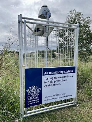
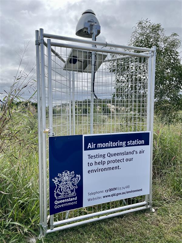
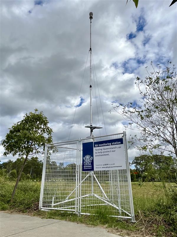
The department monitors air quality and weather at various locations in Queensland, with a specific program focusing on industrial areas at Swanbank and New Chum in Ipswich. In 2022, the monitoring equipment was upgraded to address community odour concerns and improve understanding of local weather patterns and odorous compounds like hydrogen sulfide (H2S). In 2024, additional weather monitoring stations and close to real-time air quality monitors were added in nearby communities and the Swanbank industrial area, based on recommendations from independent experts.
The Swanbank air monitoring program is a scalable weather and air quality monitoring network that can be adapted as needed. The equipment operates 24/7, providing a constant stream of close to real-time monitoring data which can be analysed in conjunction with community reports about odour being experienced. This allows for a more efficient and targeted compliance response for those industrial operations that are regulated by the department. The information can also be used to help inform actions of other agencies such as local government and Queensland Health.
View more information about potential health impacts associated with odour.
What is being monitored?
Wind and weather conditions
Several stations are collecting weather monitoring data, such as wind direction, speed, temperature and humidity, which is analysed in conjunction with air quality monitoring data.
Hydrogen sulfide (H2S)
H2S is a colourless gas with a “rotten egg” smell. It is part of a group of chemicals called Total Reduced Sulfur (TRS). TRS includes other odorous sulfur compounds like mercaptans and sulfides. In Swanbank and New Chum, H2S is used as an indicator for odour as it forms the highest proportion of TRS from these areas.
H2S monitors are co-located with wind and weather monitoring stations.
Volatile Organic Compounds (VOCs) and Ammonia (NH3)
While common air emission sources of VOCs and NH3 are through vehicle emissions and industrial processes, they are also naturally released during the aerobic decomposition of organic material such as plant debris. These compounds are known to be odorous and can be more noticeable during summer and spring.
Specialised equipment are used for monitoring VOCs and NH3 concentrations as there are several facilities within the Swanbank industrial area that handle organic waste including landfill and composting operation.
Where are the monitoring stations?
Monitoring equipment has been placed both within potentially affected communities and near industrial sites.
The following monitoring equipment has been installed (total of 13 stations) and is shown in the Weather and Air Quality Monitoring Network map 4 MB) .
| Station name | Location | Parameters being monitored |
|---|---|---|
| Church weather station | Grace Christian Church, 1 School Rd, Redbank Plains |
Wind direction, Wind speed, Temperature, Relative Humidity, Barometric pressure, Solar Radiation H2S |
| Hockey wind station | Ipswich Hockey, 65 Briggs Rd, Raceview |
Wind direction and wind speed H2S |
| South Ripley weather station | South Ripley Park, 9 Freedom Cres, South Ripley |
Wind direction, Wind speed, Temperature, Relative Humidity, Barometric pressure, Solar Radiation H2S |
| Riverview wind station | Haydens Park, 14 Hayden St, Riverview |
Wind direction and wind speed H2S |
| Staines weather and air quality station | Staines Memorial College, 227-243 School Rd, Redbank Plains |
Wind direction, Wind speed, Temperature, Relative Humidity, Barometric pressure, Solar Radiation H2S, Total VOCs, NH3 |
| Swanbank weather station | Swanbank Power Station, 305-311 Swanbank Rd, Swanbank |
Wind direction, Wind speed, Temperature, Relative Humidity, Barometric pressure, Solar Radiation H2S |
| Ripley weather station | Pebbles Dog Park, Near 622 Ripley Rd, Ripley |
Wind direction, Wind speed, Temperature, Relative Humidity, Barometric pressure, Solar Radiation H2S |
| Redbank weather station | Tofa Mamao A Samoa Park, 27 Kruger Parade, Redbank |
Wind direction, Wind speed, Temperature, Relative Humidity, Barometric pressure, Solar Radiation, Rainfall H2S |
| Blue Gum Reserve weather station | Tornadoes Rugby League field, 54 S Queensborough Parade, Karalee |
Wind direction, Wind speed, Temperature, Relative Humidity, Barometric pressure, Solar Radiation H2S |
| Swanbank 1 air quality monitoring station | Abrahams Rd, Swanbank | H2S, Total VOCs, NH3 |
| Swanbank 2 air quality monitoring station | Lantrak, 1 Memorial Dr, Swanbank | H2S, Total VOCs, NH3 |
| Swanbank 3 air quality monitoring station | Abrahams Rd, Swanbank | H2S, Total VOCs, NH3 |
| Swanbank 4 air quality monitoring station | Mount Juilleratt Drive, Swanbank | H2S, Total VOCs, NH3 |
Weather and air quality data
Air monitoring stations collect weather and air quality data which provide an indication of air conditions in the region.
You can access this data by using our interactive data map by clicking the link below.
View weather and air quality map
Note: The data presented has not been validated and is given in close to real-time for informational and indicative purposes only. Any utilisation or interpretation of this data should be in consultation with the Department of the Environment, Tourism, Science and Innovation.
The data presented is directly sourced from the monitoring network (operated and managed by an external provider – Envirosuite) and has not undergone a quality assurance review.
Swanbank air monitoring tutorial
When opening the map, you will see all monitoring stations that are depicted by the labelled icons.
The white border shows generally where industrial activities are located in Swan Bank and New Chum.
The network has three types of stations.
Wind stations measure wind speed and direction, weather stations measure various meteorological parameters such as wind speed, wind direction, temperature, humidity and barometric pressure, and air monitoring stations measure key odour related parameters such as hydrogen sulphide, H2S, ammonia and H3 and total volatile organic compounds or VOC's.
In the top left hand corner you can see the selected parameter and the time and date of the data being viewed.
If the dot is flashing green, this indicates that you are viewing data in real time.
If you click on the dot and select a previous date and time, the dot will change to orange, indicating you are viewing historical data.
To go back to real time, simply click on the dot again at the bottom.
You can also use the scroll bar to view the data from the last 24 hours.
Note that if you scroll to a previous hour, it will change the dot back to orange, indicating that you are viewing historical data again, just click the dot to return back to live data.
Live weather data including temperature, wind direction, speed, rainfall, and humidity can be seen at the top right hand corner of the map.
Wind or weather stations are identified by the icons with blue arrows.
The arrow indicates the wind direction at that station and the number in the middle represents the current wind speed in metres per second.
To view the live data for a station, click on the icon.
This will bring up a panel at the bottom of the screen showing the current parameters that are measured by that station.
It will also tell you the name of the station that you are currently viewing.
Some wind or weather stations may also collect additional parameters as the network expands, so you may see other parameters in addition to meteorological data for some stations.
To view a graph of the data, click on a parameter at the bottom left and it will show you a graph of that selected parameter.
You can select one or multiple parameters as well as adjust the time period you wish to view using the drop down on the right.
Air monitoring stations are identified by the icons with the pink dots.
The number in the middle represents the live reading of the selected data.
For example, the selected parameter is currently hydrogen sulphide or H2S, so it is showing the live reading of hydrogen sulphide.
It's important to note that the live reading is not typically used for identifying nuisance or health impacts.
Averages are typically used to account for exposure time and associated risk.
You can learn more about this in the Interpreting Data part of this tutorial.
To view the live data for a station, click on the pink icon.
Again.
This will bring up a panel at the bottom of the screen showing the current parameters that are monitored by that particular station.
The panel will show a live reading as well as time weighted averages for each of the parameters.
To view a graph of the data again, click on a parameter at the bottom left side and it will show you a graph of the selected parameter.
You can select one or multiple parameters as well as adjust the time period using the drop down on the right.
To compare a particular parameter across multiple stations, select the parameter you want to view from the drop down in the top left hand corner.
Click on at least two or more air quality stations that you wish to compare and it will bring up a panel at the bottom of the screen that will show the live reading of the selected parameter for the selected stations.
You can click the stations on the left hand side of the panel to add or remove it from the graph.
You can also adjust the time period you wish to view by using the drop down on the right.
If you click on another station and no additional ADATA appears, this means that the selected station does not currently monitor the parameter.
To change the parameter you wish to compare, simply change it in the drop down in the top left hand corner and select the air quality stations again.
When viewing data from a station, it is important to look at the averages carefully to interpret the data correctly.
Time weighted averages, which means the average reading over a certain time period, are used when considering the potential for nuisance and health impacts to account for exposure time and potential risks to community.
When viewing data from a station, the time weighted averages shown are reflective of the time weighted averages that are used as thresholds for nuisance or health.
For example, we have a 30 minute and a 24 hour average for hydrogen sulphide as these are the time averages specific to hydrogen sulphide.
Ammonia has a 10 minute and a one hour average as these are the thresholds for ammonia.
The time weighted averages that we use for considering nuisance and health vary based on the parameter, so it's important to view the correct average for that parameter.
For more information about the threshold indicators used for each parameter, you can visit our web page.
Navigating the interactive map
The interactive data map shows the location of all monitoring stations and data as it is being collected in close to real-time (updated every 5 minutes). Data is shown in Australian Eastern Standard Time (AEST).
The map shows the current data and time by default (in the top right corner) and will indicate that live data is being shown by a pulsing green dot.
- To view historical data, click on this section and select a date using the calendar. When historic data is being viewed, the dot will change to an amber colour. To return to live data, click on the amber dot.
- You can navigate through time by using the light blue scrolling bar at the bottom of the page.
Note: You may only view historical data from when the station was commissioned. If no data is showing on the map for a station, it could indicate a fault in the equipment or transfer of data. Any errors or faults are investigated and rectified as soon as possible.
For detailed guidance on using the map and viewing data please refer to the Envirosuite user guide 4.2 MB) .
Viewing wind and weather data
Wind speed and direction are monitored by wind and weather monitoring stations. Some monitoring stations may also collect air quality data such as H2S, NH3 and VOCs.
- Wind direction is represented by blue arrows (as shown in image 1 below), on the wind or weather monitoring stations.
- Wind speed (in metres per second) is indicated by the number in the centre.
Viewing air monitoring data
You can view a number of parameters measured by the stations, such as hydrogen sulfide, ammonia, VOCs and other meteorological data. Air monitoring stations are represented by pink dots (as shown in image 2 below). The number in the centre represents the real-time measurement of the parameter that is currently selected (in the top right-hand corner drop-down).
- Select a parameter by using the dropdown menu in the top left-hand corner of the map. Once selected, data will be displayed from all stations that monitor this parameter.
- Click on an individual station to view all parameters measured by that station, and a time series line graph that shows historic data. This will also show time-weighted averages, which are used to identify potential nuisance impacts.
- Deselecting the parameter will remove it from the graph.
- If multiple stations are selected, the common parameters monitored at the station will be displayed (based on the selected parameter) to allow comparison of the data at different locations.
Interpreting the data
Odour emissions are shown in parts per billion (ppb) at various time weighted averages (average emissions in ppb for a given timeframe) which are used as threshold indicators for potential nuisance or health impacts. The time weighted average used varies based on the parameter we are measuring.
The below table shows some of the concentrations that are used as indicators to help inform investigations. These levels take into account various references including the Environmental Protection (Air) Policy 2019, national and international standards and guidance.
| Parameter | Nuisance level | Health level |
|---|---|---|
| Ammonia (NH3) | 5,000 ppb (10 minutes) |
4,600 ppb (1 hour) 1,700 ppb (24 Hours) |
| Hydrogen Sulfide (H2S) | 5 ppb (30 minutes) | 108 ppb (24 hours) |
| Total VOCs | 68.6 ppb (10 minutes) | 365.4 ppb (1 hour) |
What happens when a nuisance or health indicator is exceeded?
Exceeding one of the concentrations listed in the table indicates that there is a potential for the community to be experiencing impacts, and does not necessarily mean a health impact or that a nuisance is occurring.
If a threshold indicator is exceeded, the department verifies the data's accuracy and reviews meteorological information to identify any potential source(s). Reports from the community of odour nuisance occurring at that time may also be reviewed. Based on the findings, the department may contact any operator(s) identified as a possible source and take appropriate further investigations, compliance and enforcement action.
If a health-related threshold indicator is exceeded, Queensland Health will be notified and the department will collaborate with them to ensure an appropriate response. The community will be kept informed of any significant developments or actions taken.
It is also important to understand that emissions are more concentrated, the closer they are to a source. The further away they travel, the more disperse they become. As such, if a station located near a compost or landfill operator is showing concentrations above nuisance indicator levels, this means that there is a potential for nuisance within the community and the department will respond with further enquiries.
How can you help?
The reports we receive from the community help us to understand whether a nuisance or other impact is occurring. They can help to substantiate when impacts are occurring and assist our subsequent enquires.
If you are experiencing odour that is causing you a nuisance, please report it, to let us know.
You can also stay up to date on any significant developments by signing up to our newsletter.
Questions and feedback
If you have any questions or difficulty accessing the data map or if you would like to report a fault, please contact swanbank@detsi.qld.gov.au.
Air sampling canister program
Air sampling canisters have been provided to residents, education facilities and childcare centres within the community of Ipswich as part of a sampling program initiated following community members raising concerns about potential health impacts. To assist with understanding the laboratory analysis results from air samples collected by canisters, see the previously released information sheet Understanding air quality monitoring results 196.7 KB) .
The map below shows the locations where samples have been collected using canisters in the community.
Air quality monitoring is conducted at a range of locations in the local community. This includes air monitoring (canisters) undertaken by households.
The table below shows only those analytes that were detected by the laboratory in the canister samples.
2024
| Date sampled | Location | Sample ID | n-Butane | n-Pentane | 2,2,4-Trimethylpentane | Propene | Benzene | Toluene | m- & p-Xylene | Isopropylbenzene | Ethanol | Isopropyl alcohol | tert-Butanol | Acetone | Methyl ethyl ketone | Acrolein | Dichloro difluoromethane | Chloro-methane | Chloroethane |
|---|---|---|---|---|---|---|---|---|---|---|---|---|---|---|---|---|---|---|---|
| 15/01/2024 | Cotton Crescent, Redbank Plains | 24KS322-323 | 2 | 0.6 | ND | 3.2 | 0.6 | 1.2 | ND | ND | 24 | 6.3 | ND | 9.3 | 23 | ND | 0.5 | 3.4 | 2.4 |
| 4/03/2024 | Amaze Early Education Centre Redbank Plains, Tina Street, Redbank Plains | 24KS586 | ND | ND | ND | ND | ND | ND | ND | ND | ND | ND | ND | 5.4 | 0.5 | 1.1 | 0.7 | ND | ND |
| 3/04/2024 | Primrose Crescent, Redbank Plains | 24KS839 | 67 | 10 | ND | 7.4 | 2.5 | 22 | 5.3 | ND | 48 | 3.2 | ND | 8.3 | 0.8 | ND | ND | 0.6 | ND |
| 2/04/2024 | Cotton Crescent, Redbank Plains | 24KS838 | 1.3 | ND | ND | ND | ND | ND | ND | ND | 27 | 2 | ND | 4.8 | 1.6 | 0.8 | ND | ND | ND |
| 8/04/2024 | Amaze Early Education Centre Redbank Plains, Tina Street, Redbank Plains | 24KS998 | 2.8 | ND | ND | ND | ND | ND | ND | ND | 24 | ND | ND | 2.1 | ND | ND | ND | 1.3 | ND |
| 17/04/2024 | C&K Ripley, Nevis Road, Ripley | 24KS1028 | 0.8 | ND | ND | ND | ND | ND | ND | ND | ND | ND | ND | 7.9 | 0.6 | ND | 1.1 | 2.2 | ND |
| 17/05/2024 | Cotton Crescent, Redbank Plains | 24KS1251 | 18 | 1 | ND | 4.4 | ND | 3.4 | 3.2 | ND | 35 | 3.6 | ND | 9.5 | 3.2 | 1.1 | 0.8 | 1.5 | ND |
| 21/06/2024 | Fernbrook State School, Regents Dr, Redbank Plains | 24KS1802 | 3.9 | 0.9 | ND | 5 | 0.7 | 1.3 | 0.8 | ND | 8.6 | ND | ND | 2.9 | 0.5 | ND | 0.5 | 1.2 | ND |
| 27/07/2024 | Cotton Crescent, Redbank Plains | 24KS2262 | 13 | 1 | ND | 2.3 | ND | 2.5 | 1 | ND | 44 | 3.3 | ND | 11 | 3 | ND | ND | 1.4 | ND |
2023
| Date sampled | Location | Sample ID | n-Butane | n-Pentane | 2,2,4-Trimethylpentane | Propene | Benzene | Toluene | m- & p-Xylene | Isopropylbenzene | Ethanol | Isopropyl alcohol | tert-Butanol | Acetone | Methyl ethyl ketone | Acrolein | Dichloro difluoromethane | Chloro-methane | Chloroethane |
|---|---|---|---|---|---|---|---|---|---|---|---|---|---|---|---|---|---|---|---|
| 6/07/2023 | Cotton Crescent, Redbank Plains | 23KS1551 | 11 | 16 | ND | 3.9 | ND | 1.5 | 0.6 | 0.8 | 120 | 19 | 1.5 | 10 | ND | ND | ND | 0.7 | ND |
| 9/08/2023 | Cotton Crescent, Redbank Plains | 23KS1643 | 1.3 | ND | ND | 1.2 | ND | ND | ND | 1.3 | 21 | 0.6 | ND | 1.9 | 1.1 | ND | ND | 0.5 | ND |
| 9/08/2023 | Alawoona Street, Redbank Plains | 23KS2236 | 1.3 | ND | ND | 1.3 | ND | 1.3 | ND | 1.3 | 12 | 1.3 | ND | 2.5 | 1.3 | ND | ND | 1.3 | ND |
| 25/09/2023 | Sunbird Drive, Redbank Plains | 23KS5330 | 2.7 | ND | ND | 2.1 | ND | 0.6 | 0.6 | 1.8 | 29 | 1.0 | ND | 4.9 | 1.4 | 0.6 | 0.6 | 0.6 | 2.2 |
| 18/10/2023 | Fernbrook State School, Regents Dr, Redbank Plains | 23KS5612 | 1.4 | ND | ND | 1.2 | ND | ND | ND | ND | 23 | 0.6 | ND | 7.1 | 1.8 | 0.6 | 0.6 | 1.6 | ND |
| 18/10/2023 | NW of Nugrow Site, Memorial Dr Swanbank | 23KS5613 | ND | 0.9 | ND | ND | ND | ND | ND | ND | 24 | 1.2 | ND | 6.7 | 1.6 | 0.5 | 0.6 | 1.5 | ND |
| 23/10/2023 | Waterfern Way, Ripley | 23KS5619 | 0.5 | ND | ND | ND | ND | ND | ND | ND | 0.8 | 0.5 | ND | 2.5 | ND | ND | 0.7 | 1.9 | ND |
| 26/09/2023 | Parkview Parade, Ripley | 23KS5552 | 1.8 | ND | ND | 2.6 | ND | ND | ND | ND | 16 | 1.6 | 0.7 | 3.2 | 1 | 0.5 | ND | ND | ND |
| 10/10/2023 | Cotton Crescent, Redbank Plains | 23KS5570 | 5.3 | 0.5 | 1.1 | 2.1 | 0.8 | 2.5 | 1.2 | ND | 10 | ND | ND | 2.6 | ND | 0.6 | 0.5 | ND | ND |
| 12/10/2023 | Cotton Crescent, Redbank Plains | 23KS5569 | 0.7 | ND | 1.5 | 0.8 | ND | ND | ND | 2.2 | 13 | 2.4 | ND | 7 | 0.9 | ND | ND | ND | ND |
| 17/10/2023 | C&K Ripley, Nevis Road, Ripley | 23KS5604 | ND | ND | ND | ND | ND | ND | ND | ND | 11 | ND | ND | 3.2 | ND | ND | 0.6 | 1.2 | ND |
| 22/11/2023 | Caithness Street, North Booval | 23KS6629 | 1.2 | ND | ND | 1.1 | ND | ND | ND | ND | 18 | ND | ND | 1.5 | ND | ND | 0.6 | 0.6 | ND |
| 1/11/2023 | Rhythm Road, Ripley | 23KS6456 | ND | ND | ND | ND | ND | ND | ND | ND | 7.3 | ND | ND | 1.9 | 0.5 | 0.6 | 0.6 | 0.6 | ND |
| 8/12/2023 | Waterfern Way, Ripley | 23KS7023 | 1.1 | ND | 0.7 | 0.5 | ND | 0.5 | ND | ND | 8.9 | 0.7 | ND | 3.6 | ND | 1.8 | 0.5 | 0.7 | ND |
| 15/12/2023 | MacNamara Place, Redbank Plains | 23KS7516 | 4.9 | ND | ND | 1.5 | ND | ND | ND | ND | 21 | 1.3 | ND | 13 | 1.7 | 1.2 | 0.7 | 2.2 | ND |
| 15/12/2023 | Fischer Road, Ripley | 23KS7515 | 0.8 | ND | ND | ND | ND | ND | ND | ND | 27 | 13 | ND | 33 | ND | 1 | 0.7 | 1.8 | ND |
| 1/12/2023 | Cotton Crescent, Redbank Plains | 24KS21 | 15 | ND | ND | 1.6 | ND | 0.7 | 0.8 | ND | 73 | 33 | 0.5 | 7.9 | 2 | ND | 0.8 | 2.3 | ND |
| 1/12/2023 | Bellbird Drive, Bellbird Park | 24KS322-323 | ND | ND | ND | ND | ND | ND | ND | ND | 6.9 | 7.9 | 0.6 | 6.3 | 1.1 | 1.8 | ND | 0.8 | 2.6 |
| ND | Below the limit of reporting and not detected |
|
Below the short-term health-based guidelines published by the Texas Commission on Environmental Quality (TCEQ) *Ontario Ministry for Environment – Ambient air quality criteria (Propene) | |
| Above the short-term health-based guidelines published by TCEQ. |